
For each and every business, branding is an important key to success. Branding creates awareness among people about the products and services. It helps people to identify products and services, and also helps in understanding their purpose and necessity. Apart from this, it is not only the brand that is important for a business, but also the colors of the brand. When chosen right, the colors help an organization to reach better targets at a rapid speed. Success of the branding is achieved with a color in the brand i.e. nearly 60% to 80% of the brand reaches customer through the color used in it. The colors of a brand talk more about the business as the colors themselves reflect the brand, as each color persuades different emotions with the people. Colors in your brand also help you to personally connect with people’s mind emotionally.
The color increases your brand recognition by 80%. Integrating brand colors in logo, website, products, promotional contents like advertisements, infographics, presentations, social media content etc., is the best way to register your brand to the audience. Nearly 75% of the people buy products for their colors irrespective of the brand. So, color comes before the brand and it is important to choose colors wisely.
People’s response changes from
color to color, and the psychology of colors plays differently based on gender,
culture, personal experience, neurological variance and so on. It is always
important to choose right color for branding. More the color evokes the people’s
feelings; more will be the reach of your brand.
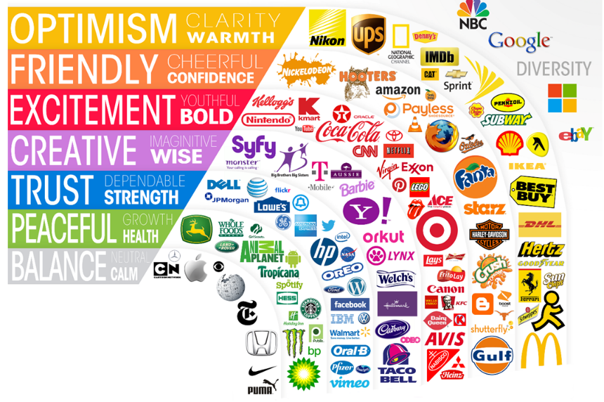
Colors that made the brand successful
Among the most popular brands, the commonly used color is blue, nearly 40% of the top brands use blue color. Red is the second preferred color which covers 30% of the popular brands, Black & Greyscale and Yellow & Gold colors come in third and fourth places respectively.
Moreover, attempting multi-color is also not advisable. Top brands use one or two colors in branding. Brands like google, NBC, Microsoft are exceptions for using four to six colors.
Color psychology
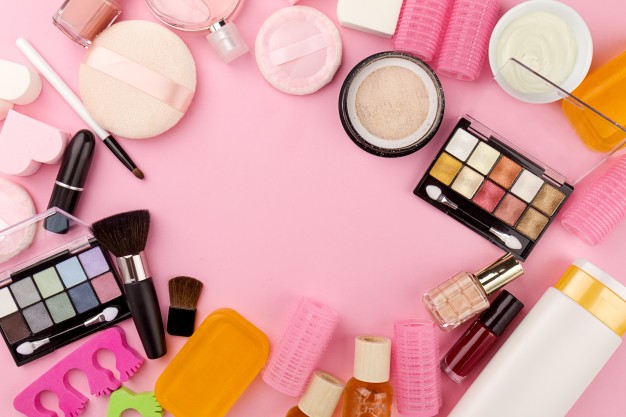
Each color reflects its own meaning and popularity. So, before choosing a color for your brand, be precise in your product category. For example, men suits are promoted in Black and Blue for being bold, cosmetics are promoted in Red and Pink for attraction, beverages and water are promoted in Blue and Green for refreshments. Normally, customers take only 90 seconds to choose one product among similar products and 85% of the people blindly choose it based on the color.
Pick your color
Red
Red is one of the attention-grabbing colors that provoke strong emotion in human mind. The wavelength of Red is very long, so it appears to be nearer than its actual position. Red color reduces the analytical thinking and stimulates an intense feeling to hurry up an action. This is the reason behind red colored tag on “call to action buttons” in website and stores. The iconic color red is used in popular brands like coco cola and YouTube, more specifically, red colored play button in YouTube urges to click the button to play the video.
Red color evokes aggressiveness, energy, excitement, passion, provocative, power, strength.
Yellow
Yellow is as powerful as red color and it evokes bliss and positivity. It is the most visible and noticeable color and also associated with the shade of Sun that brings hope and optimism. Some brands use little touch of yellow color in their website to bring cheerfulness and positivity. The luxury brand Ferrari is associated with yellow color to bring the feeling of happiness, summer and a carefree lifestyle.
Yellow color evokes positivity, light, warmth, motivation, creativity, happiness, optimism.
Orange
Orange is a fun and energetic hue that sits across the crossroad of red and yellow. It has both optimism and brightness of yellow and passion and energy of red. It is not as prominent as red, but many marketers use this color as a call-to-action buttons. Orange is mostly associated with food and warmth and so majority of the food industry pack their food products in an orange tone.
Orange color evokes friendliness, fun, cheer, comfort, exuberance, courage, confidence, warmth, innovation, energy, enthusiasm and excitement.
Blue
Blue is the most popular choice for top brands in world. Nearly 42% of the people’s favourite color is blue and it is particularly preferred by men. While red evokes body, blue evokes mind and it provokes calmness, clarity and communication. Blue is familiar with our daily life in environment as sky, oceans and lakes which makes the color as non-threatening, trustworthy and stable. This is the reason why banking and social media such as Facebook, Twitter and Skype use blue color to make the users feel safe with their usage.
Blue color evokes trust, security, responsibility, confidence, loyalty, dependability, logic, serenity, coolness, calm.
Green

Green is highly connected with nature, money and positivity. Different shades of green relate different meanings. Lighter shades of green are associated with calm attitudes, and darker shades of green is associated with wealth or prestige. The popular brand John Deere uses green in its logo and products. The agricultural and lawn care equipment of John Deere are in same shade of green color. That way, when someone sees that product, they’ll immediately know it belongs to John Deere.
Green color evokes wealth, health, prestige, serenity, generosity, safety, hope, freshness, nature, growth, prosperity.
Turquoise
Turquoise is an evolutional color that resides in peculiar position between trustworthy blue and ease green. Tints of turquoise give a trace of feminine touch and darker shades of turquoise give a sophisticated feel. Too much of turquoise can cause one to become over analytical, fussy, and egocentric, allowing one to let logic guide decision-making. Mostly, turquoise color is spotted on communication centred brands like education, media, and computer technology.
Turquoise color evokes inspiration, energy, positivity, creativity, communication, clarity, calmness, self-expression, healing.
Pink
Pink has been associated with femininity for long term and it has been widely used in all brands that target women. Pink is soft and it is the sweet side of Red and it always has its charming priority among girls. This is the reason behind the brand Barbie that uses pink color so intensely.
Pink color evokes friendship, affection, harmony, inner peace, and approachability.
Purple
Purple is a magical and sophisticated color. Due to its royalty and elegance, it always brings up products to high end. The purple color has shortest wavelength and least visibility. So, it is associated with time, space and cosmos. Purple draws a perfect balance between masculine and feminine. Different shades of purple evoke different emotions.
Purple color evokes royalty, elegance, sophistication, nostalgia, mystery, spirituality, wisdom, luxury, wealth, imagination.
White
White color promotes simplicity, purity, and cleanliness. These qualities make white color popular in healthcare sector. Some people don’t use white color predominantly in their branding and many brands that use white as main color tend to pair it with black or grey. Apple has a wide range of accessories in white color for its chic and sleek style. Brands like ASOS and Adidas use black font in white background.
White color evokes nobility, softness, cleanliness, clarity, purity, simplicity, sophistication and freshness.
Black
Black is another classic and popular color option for brands. It’s sophisticate and bold nature, makes the color outstanding and popular among the luxury brands. Black is also a perfect color for text as it is easy to read and many popular brands that use white as a prominent color, use black as a highlighter for better contrast. Nike also uses black, white and grey color scheme for its website.
Black color evokes boldness, prestige, power, sophistication, elegance and authority.
It is important to choose the colors of our brand wisely after analysing the various aspects, as different colors portray different meanings and emotions. Choose the colors of your brand well for the colorful future of your business.
Share this blog :


Thanks for sharing, wonderful blog keep sharing, actually you are right each color represent their own attributes for example purple color shows peaceful and luxurious allure works well with brands or impart a tranquil environment, such as a yoga studio.